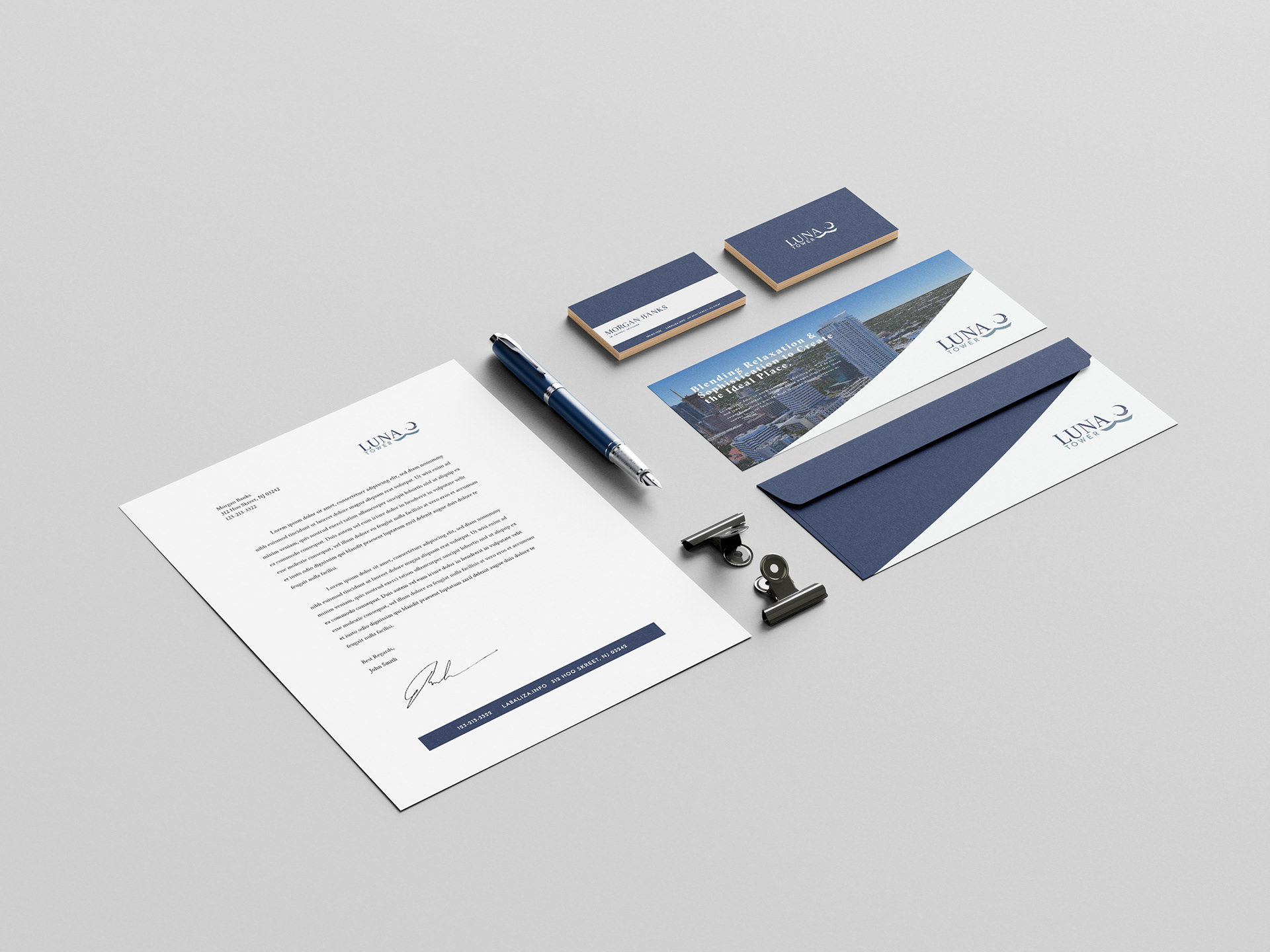
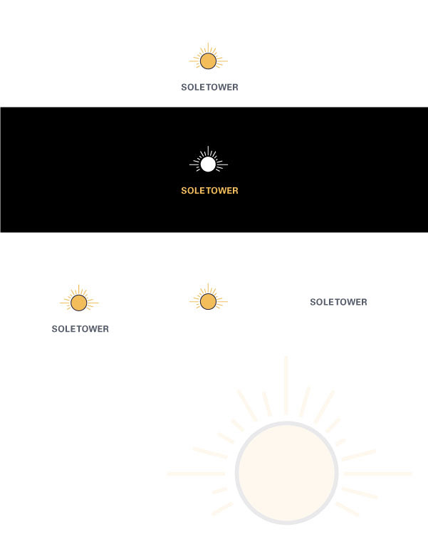
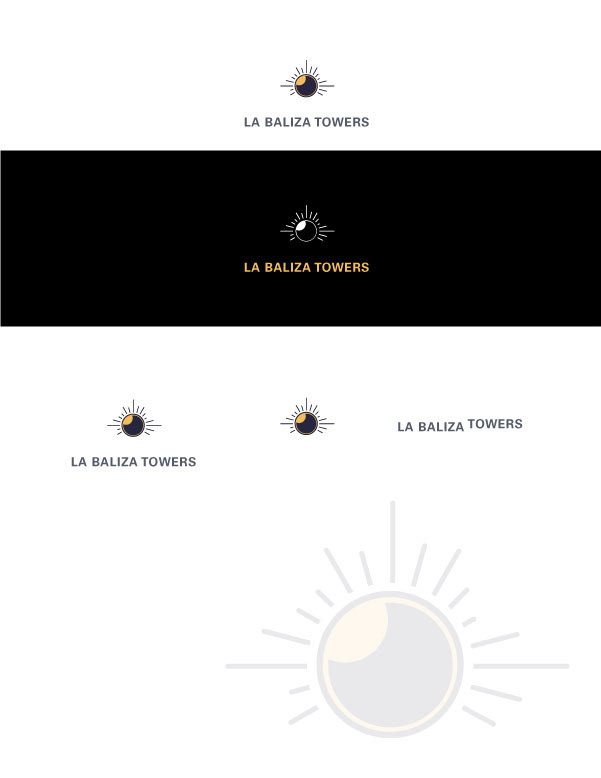
Triple luxury apartment located in Florida, we wanted to represent the Sun and Moon in the buildings since one is West and the other is East while there is one in between. The center being the main hub, called La Baliza, and respectively the West is called Sole, and the East, Luna.


The idea of the logo was to have it be able to seamlessly intergrade with one another. Which is why we have the Sun and Moon layer on top of each other with the Main Logo, creating cohesion.
Bellow I included some early concepts that lead up to the final piece that we used for the marketing campaign.
Bellow I included some early concepts that lead up to the final piece that we used for the marketing campaign.


